

BryanPlayz0518
-
Posts
10 -
Joined
-
Last visited
Content Type
Profiles
Forums
Gallery
Downloads
Events
Blogs
Posts posted by BryanPlayz0518
-
-
1 hour ago, darkstar8983 said:
It is that serious, and that is my final say on this subject. That R211 order cannot get here fast enough to undo this clusterf*** the MTA has created. Making the
") /
/ ") all R46s 🙄🙄🙄
all R46s 🙄🙄🙄
R68/a's exist bro
0 -
Is it possible you can make a L train strip map for the R143? Here is what i want them to say
L to Canarsie (Normal)
L to 8th Av (Normal)L to E105 (from 8 av)
L to Bway Junction (from Canarsie)
and lastly
L to Union Sq (from Canarsie)
0 -
Is it possible I can get the template for the R160 program?
0 -
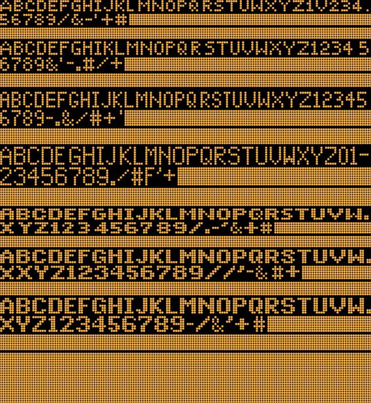
On 8/22/2009 at 11:04 AM, RTS CNG Command said:
Well, it's time! Here are the rest of the fonts!
There weren't many changes here. So far, the only noticeable ones are:
1. the addition of the "plus" sign in the thin-letter six-dot font.
2. An extended pound sign for the thick and thin-stroked seven-dotted fonts.
3. Thick "plus" signs for the thick-stroked, five- and six-dotted fonts.
This one here includes the special Luminator letter symbols found on some buses.
1. The "D" next to the E is the letter for the M14D route.
2. The "M" next to the pound sign is the "M" symbol for Manhattan.
3. The "Q" next to the "R" is the Queens symbol.
4. The "A" next to the "B" is the A-branch symbol.
5. The "S" next to the T is the Staten Island symbol.
6. The "N" next to the O is the Nassau County symbol.
7. The "X" next to the Y is the designated "Express" symbol.
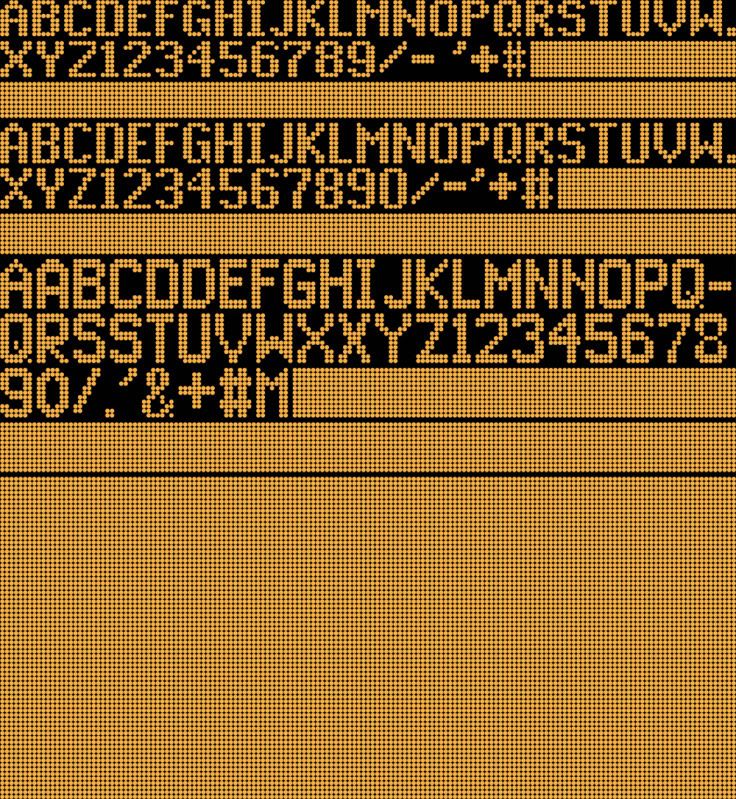
This one here has the most changes:
1. A skinnier "N" for the 15-dotted font.
2. Moved a bar for the 15-dotted "A" up one row.
3. Additions of plus signs and pound signs.
4. Tinkered with the 15-dotted "5" and 16-dotted "M."
5. Extended the 16-dotted "K" and "L" a little.
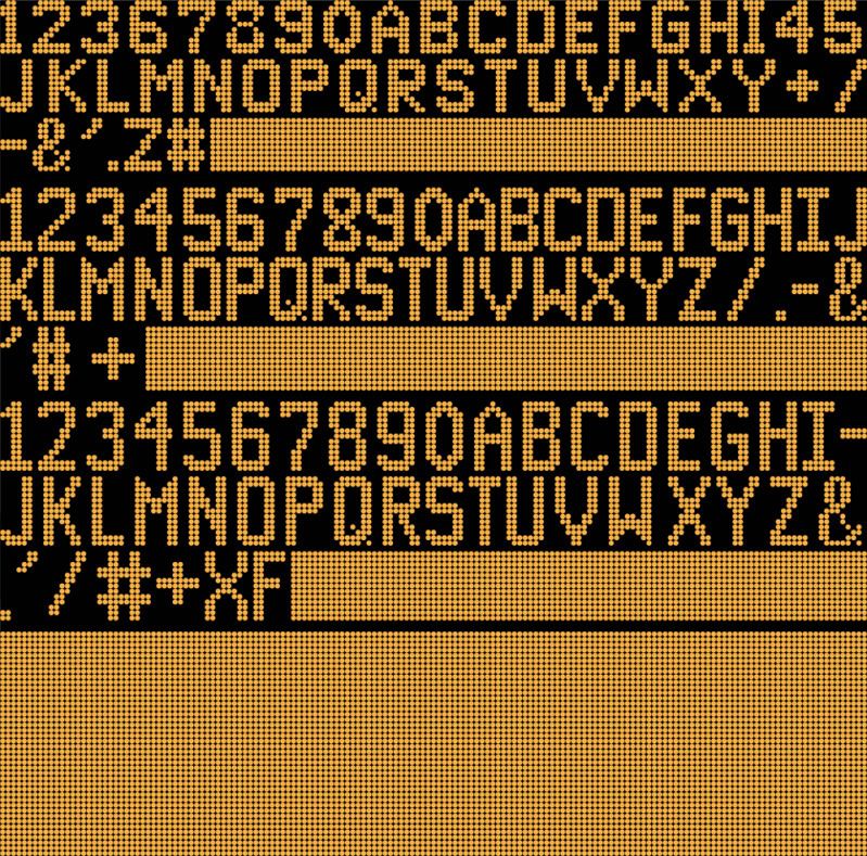
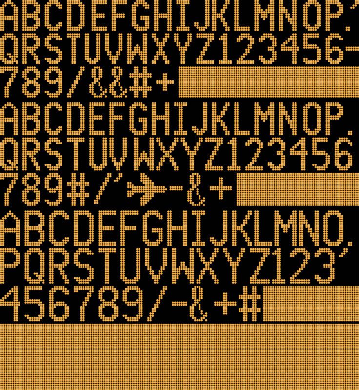
That's it! After about a year, the fonts have finally been completed. It took a lot of picture-taking, researching, and designing on Illustrator (that's the program I used to create this), but it's worth it.
Yet, this project may never actually be finished. There are also condense thick fonts out there, such as the side destination sign of the Q35 that I noticed after leaving the Roadeo. But that's for another time, and I'll get to that someday.
Soon, I will put up and link some photos that helped me recreate the Luminator fonts so you can see the resemblance, research, and inspirations to create these fonts.
I hope all of you enjoyed the "complete" collection of fonts here. Again, if there are any errors in the typefaces, let me know so I can immediately correct them. See you soon!

How do I convert this image into a TXT to use for my own signage?
0 -
I just want to know how to
Just now, BryanPlayz0518 said:I can make custom LED ones, let me attach an image. I also don't have the correct fonts sadly, so I just do my own thing.

I just want to know how to make the Flipdot effect.
0 -
On 6/9/2021 at 9:27 PM, IRT Bronx Express said:
All my signs have been reconstructed with Paint since 2010.
") What bus signs can you make? I'm curious.
What bus signs can you make? I'm curious.
You might as well since no one is... lol. If I were to take a guess, you'd want these?
I can make custom LED ones, let me attach an image. I also don't have the correct fonts sadly, so I just do my own thing.
0 -
How do you make those, I wish I could learn how to make flipdot LED's for buses, I already know how to make normal ones
0 -
Just now, DanTheSubwayMan said:
hey bryan lol
hi
0 -
R142/143 Strip Maps (Version 3.0)
in Artwork and Graphic Design
Posted · Edited by BryanPlayz0518
Is there a possibility you can make a Franklin Avenue Shuttle stripmap for the R143?