

RTS CNG Command
-
Posts
1,012 -
Joined
-
Last visited
Content Type
Profiles
Forums
Gallery
Downloads
Events
Blogs
Posts posted by RTS CNG Command
-
-
Well, ladies and gentlemen, I've finished the fantasy BxM4C Horizon sign.

Hope you guys like it.
 0
0 -
*sweeps dust off, cough* Hello again, everyone! I'm back and ready to make some more signs! My Finals are complete, so I should have more time now.
But first, replies, beginning with Harry the Great.
*blush* Thanks. Glad you like 'em. Expect more to come.They really look great. Nice job on them. :tup:
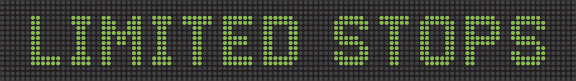
LOL! You're welcome. Maybe sooner or latr, I can cook up a fantasy Horizon "LIMITED STOPS" sign just to see more memories pop up.Niceeeeeee Thank you!! Brings back memories of waiting for that limited bus going home from school
Glad you responded, and sorry fo not responding sooner. Regarding the software, I've told this to a lot of my classmates. I tell them to BUY the suite and not download it. If anyone plans to take their work seriously and take advantage of all the unique tools in all the programs, then they should spend a few hundred bucks and get it. But only get it if you plan on using them full-time like I'm doing. (I'm doing other work on A.I. and the others aside from signs.)I got your PM i love these signs you have to make me one I tried to download the software you told me about but it takes longMore signs are on the way...including an MTA-styled LED sign of the BxM4C!
0 -
Well, another day, another sign. This one is made after Dan05979 asked me to make one.
So, without further ado, here's the flipdot!
Two changes.
1. I wrote "E. 125 St" instead of "125 St." I've always hated the fact when the Manhattan and Bronx signs don't have them, no matter how redundant they are.
2. I included the "Limited Stops" flipdot add-on that used to be on all limiteds until the late-1990s/early-2000s.
I'll be making an LED version after Finals.
0 -
You're welcome. Glad you really like it. :tup:Thank you so much! That is Awesome!
Definitely. I think I can do one better, by doing both LED and flipdots. Maybe with both that say "Limited Stops" for old time's sake? ^^Nice job, can you hook me up with M15 limited to 125 st? since i live on 1st ave?
Well, the scroll from top to bottom was found on Green Lines's LEDs. What I'm mostly wanting to do is scroll from left to right, similar to what the flipdots do. I'll definitely give it a test once Finals conclude in two weeks.depending on how you do the animations, you will need as many frames as there are for how many dots high the sign is, then in each frame have the new message start from the top and line by line replace the old message.
*laugh* Maybe someday, we three should hook up and have a good ol' fashioned busfan parade. ^^You are literally one bus ride away to my neck of the woods lol.0 -
Well, as requested, Cait, here's the X17J sign!

I hope you don't mind that I "fixed" the sign a tad (I made "New Jersey" one pixel bigger.
)RTS Command CNG, I love the bus sign.Can you do for few buses?
S89 bus.

I-Bus

Rockland Coach #11C

Thanks, Yuki! Glad you like 'em.
As for the other three, well, I think so. I can definitely make the S89 one, though.
 0
0 -
By all means. I'd LOVE to do one. Have some shots for me to use as reference?I have a request if you dont mind. I'd like to use it as a signature. Can you do one with the x17J? I can provide some shots but they would be with the Luminator Horizon LEDs (the orange ones on the MCIs.)*goes to set up Luminator Horizon template on Illustrator*
0 -
Well, guys, another day, another Luminator sign.
This time, I made up the complete sign and route. This route is an express based off the
 train and part of MTA Bus, called the QM7. It goes from Times Square to Citi Field/Shea Stadium via Roosevelt Avenue.
Here's the sign!
 0
0 -
That is true, and I'm glad you brought this up. When the MTA acquired Green Lines, they reconfigured the signs to their format. However, Green Lines's signs are a little similar to many of the ex-Private Lines. Unlike the sixteen-pixel numbers and letters, the biggest the characters can get is fifteen. Also, the fifteen-pixel font is a little narrower than the sixteen-pixel ones, so they can fit more thicker characters. (From what I know, none of the ex-PBLs use thin type on their Luminators; whenever more info had to fit, the ex-PBLs either skipped a line or made the designated route number smaller.)For the Q60 sign, I would think that the font sizes would be a little thinner in font size
Photos taken by TTMG Member, Gary Chatterton & Christopher Jordan


Another key clue: the MTA does not use ampersands -- this character: & -- while many of the ex-PBLs did.
Here are the photos that helped me make my Q60 sign (from BusTalk, not BusChat):
http://gallery.bustalk.info/displayimage.php?album=183&pos=129
http://gallery.bustalk.info/displayimage.php?album=183&pos=127
0 -
Aw, thanks, KR. This is one reason why I regularly go to this forum. Because there are so many colorful and creative people around here in case I want to take a break from talking about buses or trains. ^^(N)ow this is what makes this (F)orum so unique,(W)hen you see hard work being put in .(T)hanks for the (E)xclusive:tup:
Thanks, I'm glad you like it. Due to time restrictions (College projects and exams) and lack of knowledge on programming the Adobe software, I can't do smooth translations now. But sooner or later, when I have way more time, I'll definitely give it a shot.Very awesome! It would be amazing if you can add the smooth scrolling transistion to the frames. (It's hard like Cait Sith said but its possible)
0 -
Earlier this afternoon, I decided to go down memory lane again and create two new signs similar to the ones the former private bus compaies used before being merged to the MTA.
One of the signs is close to the original and is based off some photos I looked from BusChat. The other is based off memory and is a fantasy version.
Here's the Q60 Manhattan-bound flipdot.

And here's the fantasy sign: a BM5 Starrett City-bound flipdot. (Prior to the MTA takeover and until mid-2007, it was the BQM1.)

What do you think? I appreciate some comments.
0 -
I'd love to make a TTF file myself, but I don't know how, too, unfortunately.i wonder if its possible to get em made into a font but I dont know how to do it
*chuckle* Maybe sooner or later, I'll cook up one.Those are hot lol, I'd love to see one with "Flushing - Main St Station"B)
 Thanks for the comment.
Awww, thanks.Holycrapamazing.
Thanks. And I know exactly what you're talking about regarding the orange circles. The side LEDs on many of the Orion VIIs and NGs. They look cool, too. Maybe sooner or later, I'll make some and put them up.Truly awesome. :cool:It would look nice with orange though

Thanks. These signs do take a while, about an hour to 90 minutes, depending on my research and handling of the signs to start.omg i luv these signs man. how long did it take for you to create these?Thanks for the replies. Now I'm going down memory lane and presenting a BM3 sign similar to the ones from the old Command Bus Company's RTS CNGs and Orion V CNGs.
Here it is!
 0
0 -
they look great

Do you draw out all those dots yourself or is there a font?
Thanks for the compliment.
How I did it? I designed them by using Adobe Illustrator and used photos that I and others took as reference. After I completed the signs, I transfer them to Photoshop to make them animated. This guide I made here really helps me. (I've since revised it.)
EDIT: *headdesk* Didn't realize how many people replied before I did. Thanks, everyone!
0 -
While I was looking at bus photos, namely mine, Cait Sith's, KnightRider's, and the person who took a picture of the B3K shuttle, I decided to make some bus signs. I'm a big Luminator fan, especially the flipdots and Horizon typefaces and layouts, so I went ahead and made Luminator-esque signs.
So far, I've made three flipdots. Two are fantasy, and one is close to the original.
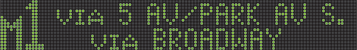
A fantasy M1 sign. It needs fixing.
The Q113 Sign.
A fantasy X90 Sign. (Prior to 1996, it used to go to East Harlem.)
Like them? I appreciate some comments. ^^0 -
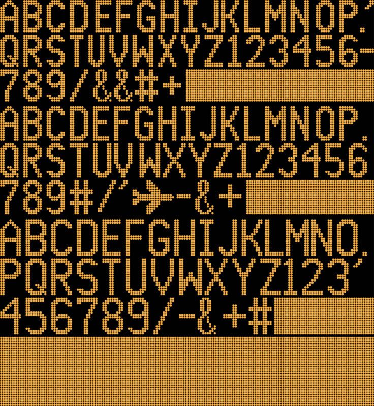
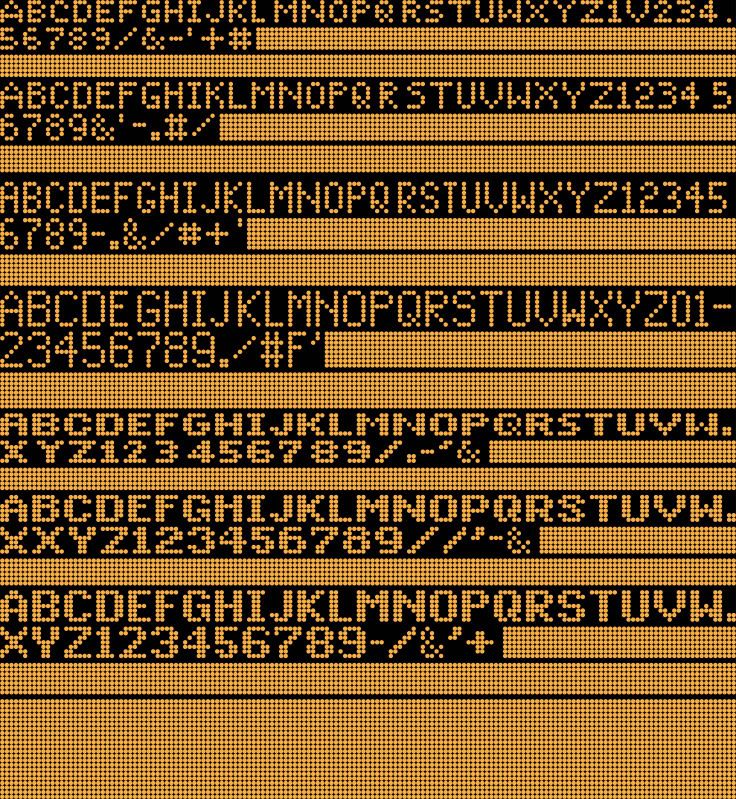
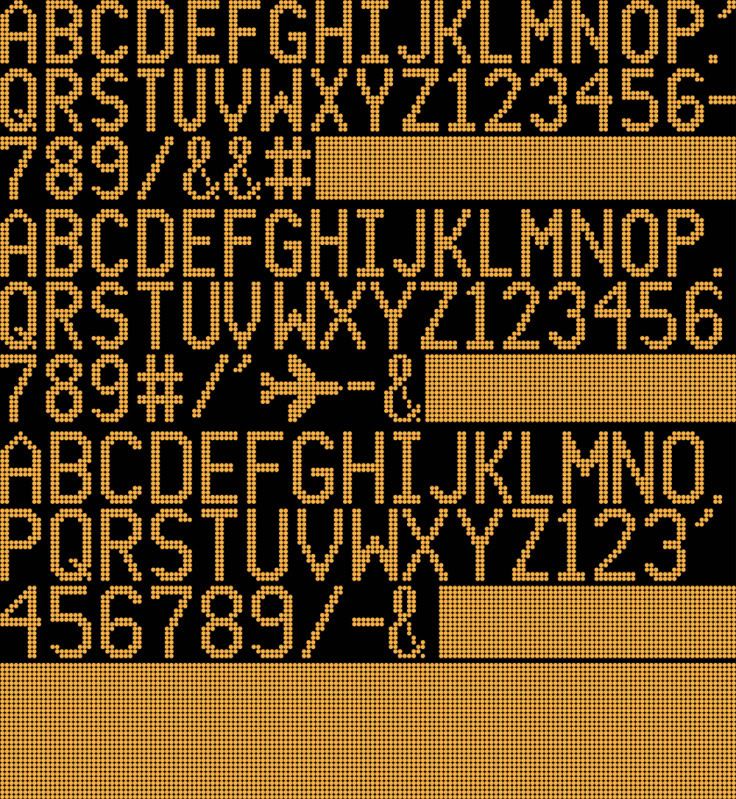
Well, it's time! Here are the rest of the fonts!
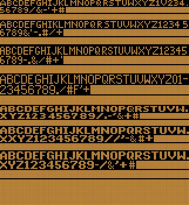
There weren't many changes here. So far, the only noticeable ones are:
1. the addition of the "plus" sign in the thin-letter six-dot font.
2. An extended pound sign for the thick and thin-stroked seven-dotted fonts.
3. Thick "plus" signs for the thick-stroked, five- and six-dotted fonts.
This one here includes the special Luminator letter symbols found on some buses.
1. The "D" next to the E is the letter for the M14D route.
2. The "M" next to the pound sign is the "M" symbol for Manhattan.
3. The "Q" next to the "R" is the Queens symbol.
4. The "A" next to the "B" is the A-branch symbol.
5. The "S" next to the T is the Staten Island symbol.
6. The "N" next to the O is the Nassau County symbol.
7. The "X" next to the Y is the designated "Express" symbol.
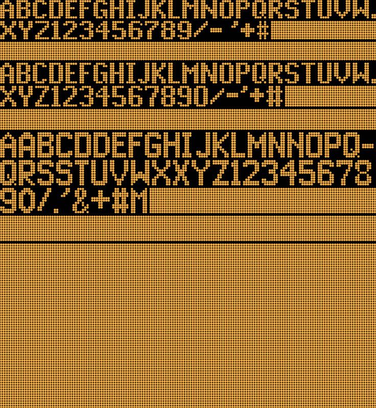
This one here has the most changes:
1. A skinnier "N" for the 15-dotted font.
2. Moved a bar for the 15-dotted "A" up one row.
3. Additions of plus signs and pound signs.
4. Tinkered with the 15-dotted "5" and 16-dotted "M."
5. Extended the 16-dotted "K" and "L" a little.
That's it! After about a year, the fonts have finally been completed. It took a lot of picture-taking, researching, and designing on Illustrator (that's the program I used to create this), but it's worth it.
Yet, this project may never actually be finished. There are also condense thick fonts out there, such as the side destination sign of the Q35 that I noticed after leaving the Roadeo. But that's for another time, and I'll get to that someday.
Soon, I will put up and link some photos that helped me recreate the Luminator fonts so you can see the resemblance, research, and inspirations to create these fonts.
I hope all of you enjoyed the "complete" collection of fonts here. Again, if there are any errors in the typefaces, let me know so I can immediately correct them. See you soon!
0 -
Thanks. By the way, you brought up a good point. The second group of fonts DO look a lot like the ones on the R32 and R38 cars. I didn't think of that before.Excellent fonts, the last one also looks like it doubles for the R32/38 front sign
You know, that's a good idea. Once I'm done, I'll get some of my photos and others that I found online to help create my fonts and post them to compare them.Very nice work. You should put the sets together with pictures so that we can compare them.
Thanks!These looks very goodMy typefaces are just about done. I just need to preview them one more time, and then they'll be published.
Also, I've made some additions and corrections of the two sets of fonts already published. Everything will be uploaded by tomorrow afternoon at the latest. See ya, then! ^^
0 -
Aw, thank you! *blush* I hope that you decided to continue working on your font.Really nice work. A couple of years ago I started working on my own fonts and know exactly how hard it is to get this done. Nice job!
Thanks. Glad you loved it!Thanks for sharing this with us. Good work!
Thanks. I hope you're continuing to work on making the signs, because once you're done, you can look back and feel proud of what you created. Like I said earlier, designing these characters were a lot of hard work. And I'm not completely done publishing them!excellet work!!! I tried this with the LCD and LED subway signs a while back and it truly is hard work! much props!Thanks for the compliments, everyone! Hope you enjoyed viewing them!
0 -
Thanks. Glad you like it.Nice, dude.
Aw, thank you! This really did take a long time. The typefaces/fonts took about two months to design and nearly complete on the computer, but it took about a year of bus-sign picture-taking and researching to get it exactly right.For all the hard work and effort, I really appreciate you doing this for all of us.More will be coming soon.
0 -
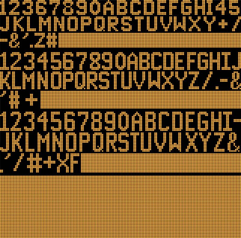
I think some of you remember my bus photos as well as my close-ups of the Luminator LED/flip-dot bus signs on the bus's front and sides. Of course, I took shots of buses for fun, but there was another reason.
What I wanted to do was to figure out the fonts of the bus signs, hence the zoom shots of the letters, numbers, and symbols. My summer project was to take pictures of the typography found on the bus signs and create the fonts for myself and make the replications as accurate to the signs as possible.
And now, as I'm almost done, I'm presenting you sets of the typography that I found (or had to make up for myself/find on other transportation systems), designed, and replicated to create a complete typography found on the MTA signs. Here are a couple of sets:
There are two more sets and will appear as late as Friday evening. See you soon! If you spot any errors, let me know, and I'll correct them.
P.S.: If you'll notice, I didn't replicate the "0" in many cases. This is intentional; the "O" and the "0" appear the same on almost all the fonts except a select few.
0
Animated Luminator Bus Signs
in Artwork and Graphic Design
Posted
@Cait: Thanks!
BTW, I got your message. Expect to see it by tomorrow evening, if not much sooner.